Thursday, January 31, 2008
Commenting
Wednesday, January 30, 2008
Reflection on Session 3
One point I find interesting is that a fellow classmate actually asked if it is against the principles of targeting a large market segment since we are focused only on one particular person. Mr Reddy's reply was that at least we can be sure that one person will buy the product rather than designing a product catered to the mass market and end up having no one buying it.
Personally, I feel that there is another reason why detailed profiling works; while we can be sure that the profiled person will definitely buy the product, we can also bank on others who may not be like the profiled person but who aspire to be. In fact, I guess most of the time it is this aspiration that leads people to consume certain products; I may not be that fit, hunky tri-athlete but I will buy the Oakley shades because I aspire to be like him.
During the presentation of our Product for Pleasure assignment, Mr Reddy also questioned why I chose the Citizen Gents Classic watch as a visceral design. Although he took in my explanation that I was looking at it from the perspective of a traditional mature man who likes stability and classic designs, I feel that perhaps I could have chosen another design that is more recognizably visceral in its design. And the new example I found is the Green Floral Watch.

Quick Facts
Brand: N/A
Model: Green Floral Fashion Watch.
Price: CAD 29.00 approx. SGD 41.00, according to http://www.xe.com/
(Source: http://www.bizlatino.biz/magnolia/jewelry.php)
Behavioral: Well, the watch is certainly able to tell time. But that's about it. It's definitely not the watch you will wear for any strenuous activities.
Reflective: It's not branded and it doesn't boast any precious stones or expensive metals.
Visceral: It’s a beautiful watch with its floral design. In fact, I believe it’s more a piece of jewellery than a functional watch. Hence, it’s definitely a visceral design.
Ok. That’s my thoughts for session 3. Let me know what you think. =)
Saturday, January 26, 2008
Assignment 1: Pleasure with Product
Visceral Design
The visceral design I have chosen is the Citizen Gents Classic Watch.

Quick Facts
Brand: Citizen
Model: Citizen Gents Classic BM8240-03E
Price: £76.00 approx. SGD 220.00, according to http://www.xe.com/
(Source: http://www.creativewatch.co.uk/citizen-astra-watches.html)
Behavioral: Well, the watch certainly performs the basic function of telling time but that's about it. Although it is water-resistant, it is not waterproof; I also doubt anyone will wear it to swim given the leather strap.
Reflective: The watch does not really have much show off value. It does not cost much and the brand positioning is not really high.
Visceral: The design is definitely timeless; it is a classic wrist watch that oozes stability and manliness.
Behavioral Design
The behavioral design I have chosen is the Casio Men's Classic Digital Watch. 
Quick Facts
Brand: Casio
Model: Citizen Men's Classic Digital Watch
Price: £7.98 approx. SGD 22.50, according to http://www.xe.com/
(Source: http://direct.tesco.com/q/R.100-1330.aspx)
Behavioral: Definitely. This watch is packed with useful functions such as alarm, illumination, timer, etc. It is also water resistant up to 50 meters, making it suitable for common water sports uses. Made of plastics and rubber, it is also lighter and longer-lasting.
Reflective: Needless to say, this is not a show watch.
Visceral: This watch looks very retro or outdated, especially with its newer counterparts like the G-shock series.
Reflective Design
The reflective design I have chosen is Patek Philippe Calatrava 5296. 
Quick Facts
Brand: Patek Philippe
Model: Patek Philippe Calatrava 5296
Price: £7,420 approx. SGD 20910.00, according to http://www.xe.com
(Source: http://www.chronomaster.co.uk/Patek%20philippe.htm)
Behavioral: This is a rather basic wristwatch without much function. It is water resistant up to 25 meters. However, it is supposedly very long-lasting.
Reflective: This watch reflects the status of the wearer, as a stable man who is capable of appreciating fine craft. The brand also reflects the social status of the wearer as a person who has arrived in the society.
Visceral: While this watch looks classical like the Citizen Gents Classic Watch, it is a fine piece of art; it is made of white gold with solid gold winding rotor, and boasts sapphire crystal case back. It also bears the Geneva Seal Hallmark.
My Reflection
Having done the classification of the 3 different design types, it strengthened my understanding that the visceral and the behavioral designs are more tangible while the reflective design is more abstract; UX designers need to be able to design products that look good and are packed with desired functions, and they also need to design status symbols
While the Citizen Gents Classic Watch looks similar to the Patek Philippe Calatrava 5296, the perceived hedonic quality of the Patek Philippe's watch is much higher. And the price of the Patek Philippe clearly shows that reflective design is necessary for a product to command a premium in pricing.
Another realisation while I was doing the classification was that the perceived product value changes over time and with people; the Casio watch was perceived to be cool and hot when it was first introduced although it now seems a little outdated to most people. With the retro-craze going on recently though, some people are spotting the watch now, as it reflects their sense of style and fashion i.e. the reflective level of processing.
Hence, I feel that a reflective design is zeitgeist of a culture and period. And UX designers can either prolong the duration of such reflections or come out with a succession of products.
I also feel that the 3 levels of design are often interlinked e.g. a good visceral design or behavioral design may translate to a good reflective design. Likewise, a good reflective design requires the visceral and behavioral aspects to back it up.
Lastly, I ponder on the balance between the 3 levels and reaffirm the statement Mr Reddy made in Session 1 that there is no absolute methodology in UX design. I guess we can only rely on thorough researches and understandings of the users in order to ensure that we design occasions that evoke positive user experience.
Reflections on Session 2
Friday, January 18, 2008
Assignment 0: A Bad (Design) Start
So the bad design I found is something that is very close to the hearts of most students and maybe the lecturers too. And it is…

Users’ Reactions
1. My personal experience with the Swing Tablet was in the lecture hall of a junior college. I had placed my files, pencil case, and some textbooks on the table when I got tired and wanted to rest awhile. I rested my head on the textbooks and unknowingly nudged the table forward. Expectedly, it swung down and all the stuffs fell onto the ground with loud thuds, disrupting the lecture. Hence, the word embarrassment aptly summarized my user experience with this product.
Interestingly though, the lecturer went on to joke that the table design forbids us from sleeping during lecture.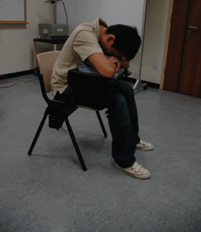
2. A friend of mine had a worse experience with this bad design. She was working on her laptop, which was on the table (duh -_-?), when she needed to get up to ask her tutor something. Her getting up movement however pushed the table forward, and swing it down together with her laptop. Her laptop crashed both physically and literally, and she lost whatever she was working on. While she forgivingly says that she should have held up the laptop, she does feel that the design can be improved or changed to function better.
What is the (design) problem?
The main problem of its design lies in the swing table. The design works in such a way that the knob holds the table and allows the user to swing it up or down in a single circular motion. However, as the knob is usually very loose, a slight nudge will result in the table slamming down; such nudges usually occurs when a user leans forward, or try to get out of the seat.
While the knob supposedly also affords the tightening of the table into position, such tightening seldom works (only 6 out of the 30 chairs that I tested are able to hold the table tightly) perhaps due to wear and tear, or the design fault of the knob.
Impression on Brand
None of the 6 friend I spoke to are aware of the brand of the chair. Personally, I did not know the brand too until I saw the name “Daglo” printed on the hind-legs of the chair upon close scrutiny.
A quick search on the Net shows that the product is manufactured by Tiong Hin Engineering (Pte) Ltd, a local furniture manufacturer. Their furniture is mainly for schools, public spaces, and offices.
The knowledge that these chairs are manufactured by a local company drew mixed feelings with 3 different camps of views; the first camp expressed support for local product, the second camp said that chairs of better quality from Japan etc. should be imported, and the last camp remained nonchalant with the gained knowledge.
My reflection
Retrospective of my experience with the swing tablet, it suddenly dawns upon me that for one product, there are different users and they might even be using the product in different manners. In the case of the chair, the school uses it as an educational facility, the lecturer uses it (in a way) to conduct her lecture, the students uses it to sit and write comfortably during lessons, etc.
And these different users may have entirely different experience with the same product. Using the chair as an example, my personal experience is not so pleasant while my lecturer's experience may be argued to be rather positive. It is interesting to note that the same event is the cause of such divisive reactions.
Likewise, a local brand can mean entirely different things to different users; the patriotic users may support the brand more while the quality-seeking users may desire foreign brands with implied, albeit possibly stereotyped, quality.
With this new 'insight', designing user experience seems to be even harder than ever, almost impossible. If I am the manufacturer of the swing tablet, how do I ensure that all the users of my product will have a positive user experience? From the functionality, to the aesthetics, to the hedonic quality; do we come out with a really generic product that is able to satisfy the needs of all users? Or do we customize the product for every single user? While the latter can be argued to be able to better create the most suitable user experience, the cost involved will definitely increase exponentially as well. How do we strike a balance then between the two extremes? I do not have an answer now, but I hope I will be able to answer this question at the end of this module.
Meanwhile, I shall ponder on the issues of Designing Content for New Media.